THE day
Today was the first day of my internship at The Lot. I really like everyone so far and I have a feeling I am going to learn a lot. I spent the last two days working on a proposal for my first “big girl” freelance job. Fortunately my boss at The Lot was able to take some time to review it for me before I sent it over to the client. I have really developed a new found understanding for design proposals. Through my Design Practices class and this client project, I have learned more about proposals this past weekend than probably ever before. My professors Michael and Jason have instilled so much knowledge into us, and its only the beginning of the third week.
In addition to it being my first day of my internship and turning in my first professional project proposal, I had the opportunity to meet with creative director of Spire Media here in Denver. It was such an invaluable meeting. Here are a few of the things I got out of it:
- When creating your personal brand, take into consideration who you will be presenting it to. If you want to be a freelance designer and work for yourself, design based on that. If you want to get a job at a firm, having a basic identity that isn’t trying to be it’s own company is important.
- ALWAYS SKETCH! get it out on paper, even if it’s quick and before you jump on the computer. Once you are on the computer and designing the project, you begin focusing on the details. Make sure you have the basic idea out before you refine.
- Stay creative outside of work. In this industry the most passionate and talented designers can get broken down and burnt out when all of your hard work and creativity gets ragged on and critiqued. By making something for you and only you, you get to keep the passion flowing and don’t have to worry about what anyone else thinks!
For your business card:
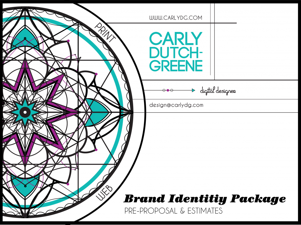
- Use your unique design that represents you on the back. Have the front focus on the information and typography. Maybe it would be cool to use the design and blow it up so large that each card gets cropped out of the design and whatever section each piece gets… well, it is what it is!
- Keep the juxtaposition between the simplified text and the dynamic design.
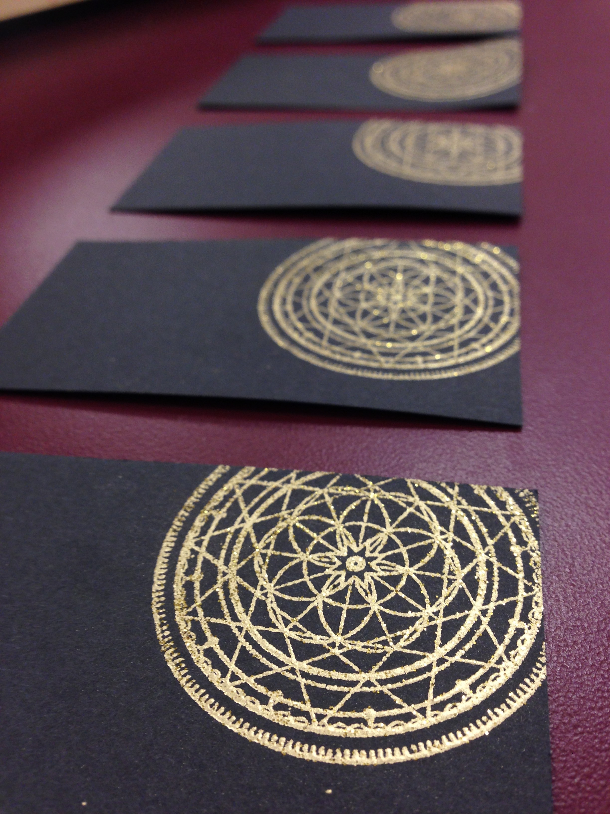
- The cool thing about your mandala is that you can easily reinvent it. The colors are totally customizable and the shapes move and rotate with ease.
For your Resume:
- Simplify the type, decide which type will go with which headline or body. Use only two fonts, 3 max! (YOU BROKE YOUR OWN RULE – SILLY!)
- The lines on the page may not be entirely necessary, have a method for how you break up the sections, don’t just put something there because there is space.
- Define where you use what colors
- Add that DIS was located in Copenhagen – it is known for design, tell ’em!
- Is listing software really necessary??
Agile vs. Waterfall design practices
- When doing a project for a client, they don’t present mock-ups to them. If coding a website, they will provide the client with wireframes to show the interaction. When you make a comp. the client expects it to look like that. Also, they may want you to do multiple revisions – that can be a total time suck.
- Present the client with parts of the project: mood boards, color pallet, typography, wireframe

Organization is Key
Today I downloaded the Tempo app to maintain a clear schedule and organization during this semester (Thanks for the recommendation Michael). I can only hope this sticks! I have a ton going on. Aside from taking 12 credits I just took on an internship with The Lot, will begin freelance work with HighBridge Creative in the next week or so. I am literally terrified but totally stoked for what is to come. Now I just have to go quit my job…
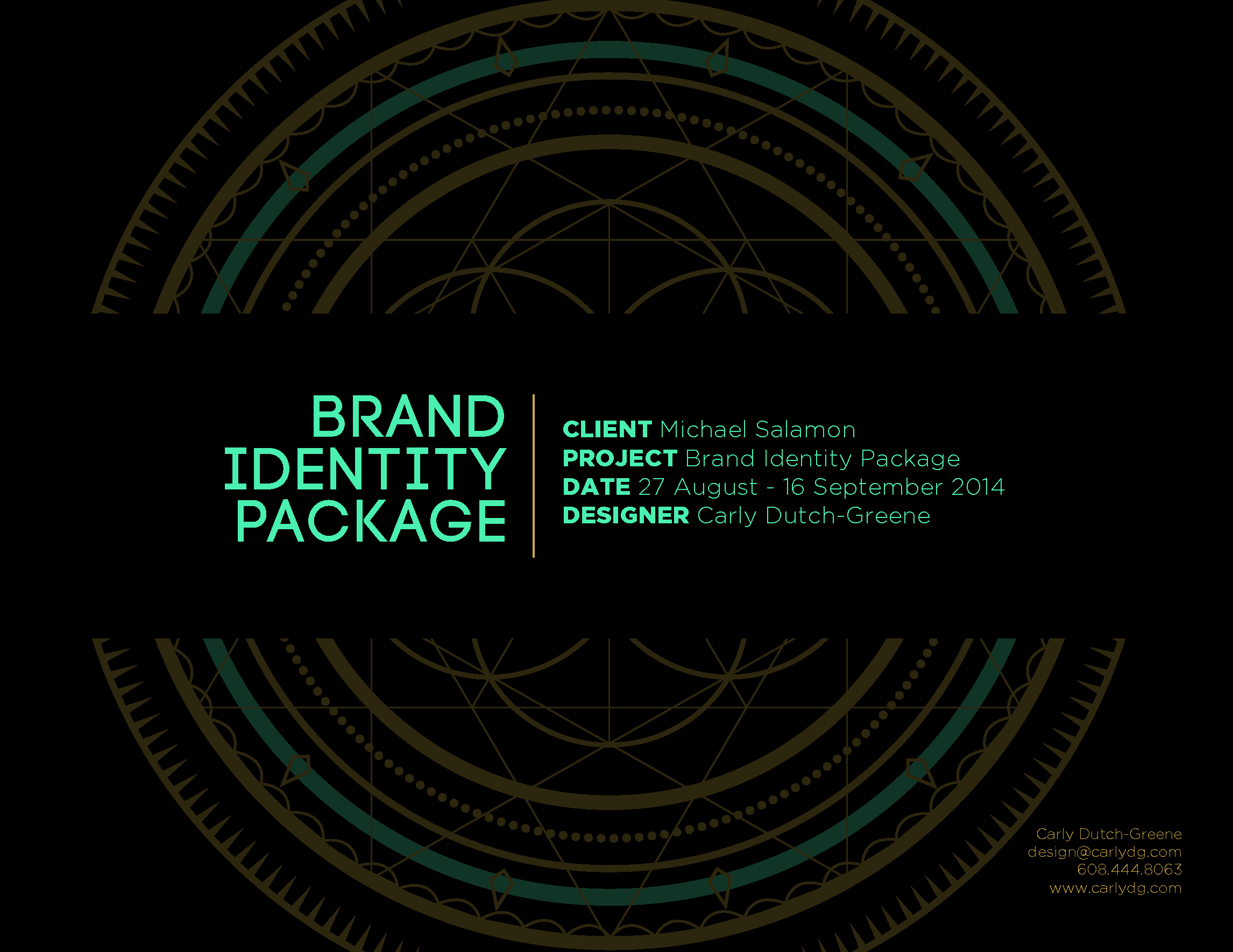
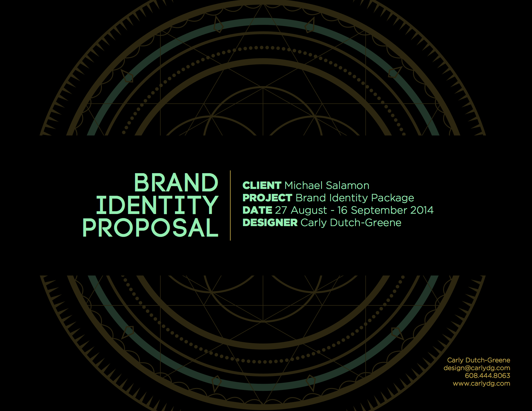
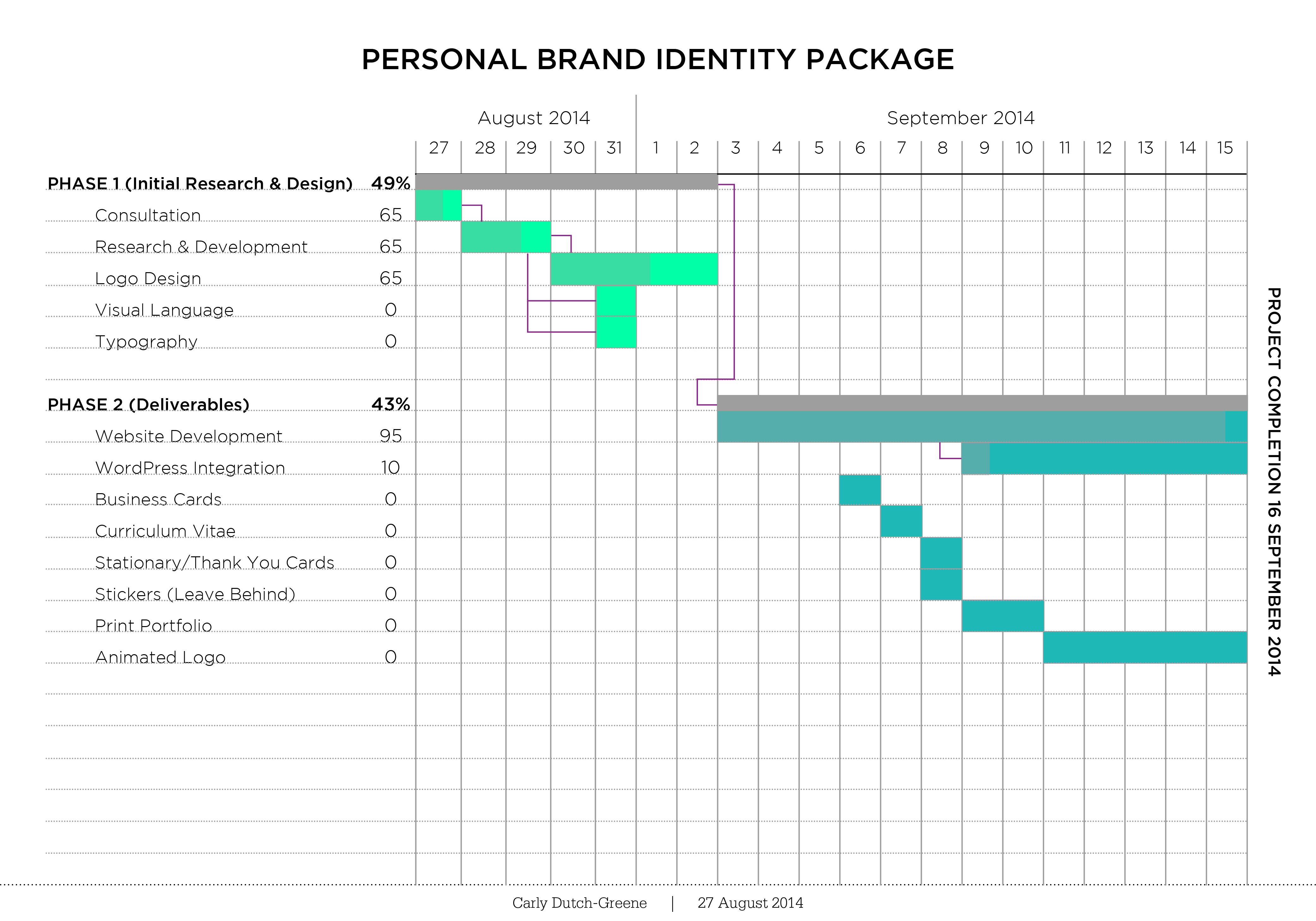
Brand Identity Estimate
Creating this brand estimate and pre-proposal was a huge learning experience. Aside from re-formatting the entire proposal, I made some pretty basic changes. I decided to re-format because I realized that my initial draft was very poorly organized and could use some serious improvement. I included a table of contents in the edited version in order to create clarity of what that purpose of the document is. I also incorporated consistent footers throughout the document. The purpose of the footer is so that the reader of the document is aware of who created it and can be reminded without having to refer back to the cover page. Various typographic and grammatical errors have also been corrected. I edited my statement about revisions to promote a more understanding and professional proposal. The changes I made to my proposal were imperative to creating a proposal that reflects my skills and understanding of the assignment.